Curriculum Layout Overview
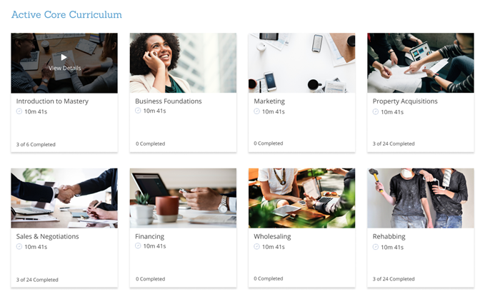
The curriculum design consists of "cards" that are displayed in a grid format.
Example Screenshot
Things to Note
- The curriculum layout is responsive, which means it will adapt to the size of the screen of the device that you are using.
- The maximum number of cards to be displayed on a single row is 4, and the number of cards per line will automatically decrease as the screen becomes smaller.
Curriculum Cards
Each card represents learning content that is attached directly to the curriculum. Learning content can either be a phase or course. Users can click on a card to access the associated content.
Curriculum Card Details
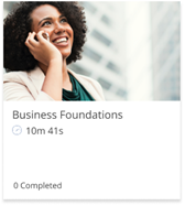
The information displayed on cards include:
- Featured Image – The featured image set on the phase or course.
- Title - The name of the phase or course.
- Hours – The amount of time it will take to complete the phase or course videos.
- Progress Indicator – The progress indicator reflects how many courses or lessons that the user has completed.
Curriculum Card Features
- Hover - If you hover over the image of a card, it will darken and display a message ‘View Details’.
- Action - Upon clicking a card, users will be redirected to the learning content that it represents.